OVERVIEW & CHALLENGE
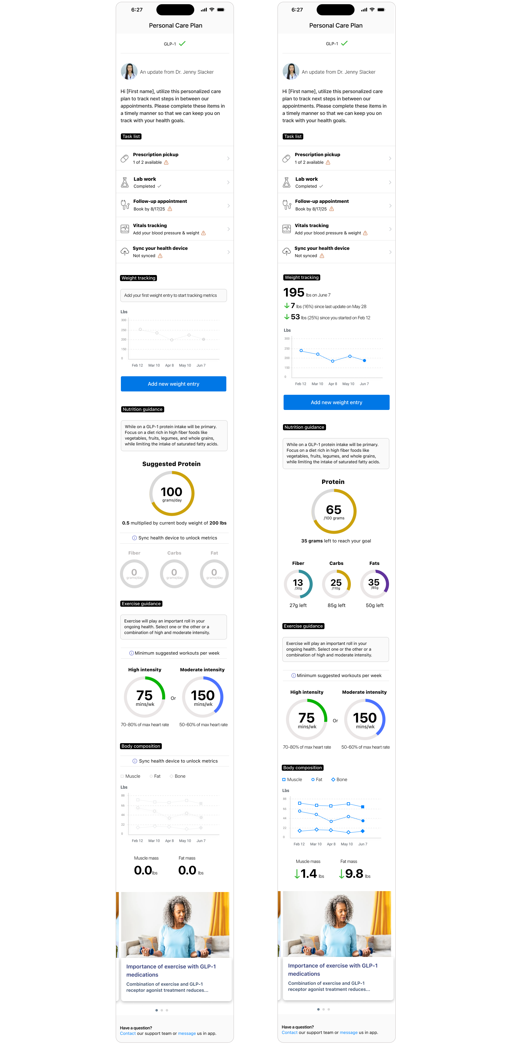
Accolade connects members with personalized healthcare support and clinical guidance. While members appreciated direct access to care teams, tracking multi-step health goals—like managing a GLP-1 therapy or chronic care plan—often felt scattered across messages, appointments, and disconnected third-party apps.
We needed to design a unified Personal Care Plan dashboard that translates complex clinical advice from staff physicians into clear, actionable daily steps and highly readable data visualizations.
ROLE
Senior Product Designer (UX/UI, Strategy, User Research, & Cross-Functional Facilitation)
PLATFORM
Mobile Web / iOS & Android App
CROSS-FUNCTIONAL COLLABORATION & CLINICAL ALIGNMENT
Healthcare UI requires strict medical accuracy and patient safety. Designing a personalized care hub required close coordination with internal partners:
Staff Physicians & Medical Directors: Helped clarfity the hierarchy of clinical guidance (e.g., GLP-1 nutrition baselines, target heart-rate zones, and body composition tracking). Ensured clinical recommendations were presented in reassuring, medically sound, and easy-to-digest language.
Engineering & Technical Architecture: Partnered with engineering to define scalable data-visualization specs. Because metrics flow from member inputs as well as connected health devices, I designed dynamic state logic (empty, partial, populated, and synched states) that plugged seamlessly into Accolade's existing backend architecture without causing rendering lag.
DATA VISUALIZATION & ARCHTECTURE
To keep members motivated without overwhelming them, I developed a system of visual components tailored for tracking progress over time:
- Weight & Body Composition Graphs: Clean line charts showing historical trends (weight loss, muscle mass change, fat mass variance) with high-contrast data points.
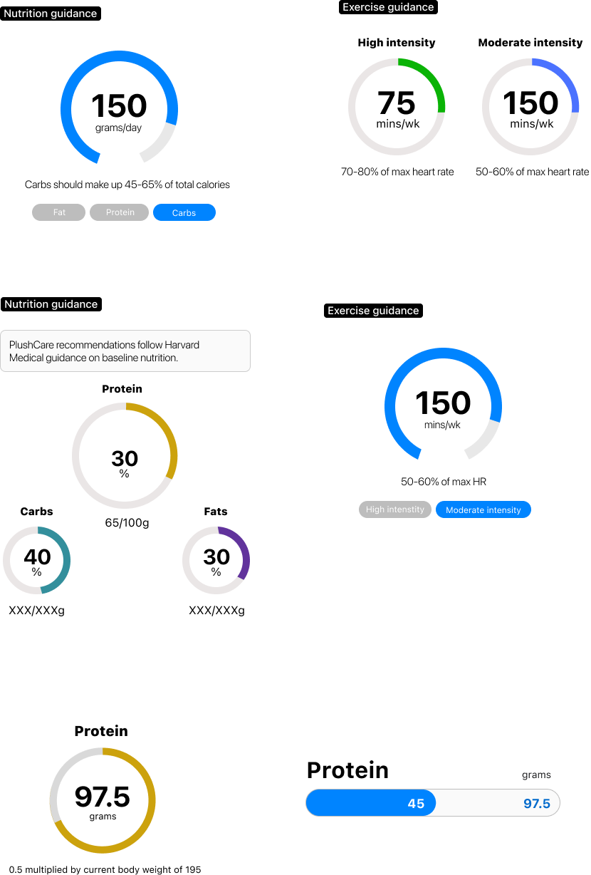
- Nutritional Macro Gauges: Radial progress indicators for protein targets, plus fiber, carbs, and fat breakdown showing remaining daily/weekly targets.
- Exercise Guidance Meters: High vs. Moderate intensity weekly gauges mapped to targeted heart rate percentage zones (70–80% vs. 50–60%).
- Empty & Synced State Logic: Designed explicit "unlocked/synced" vs. "manual entry" flows so members immediately understand how syncing a device unlocks deeper data insights.
MODERATED USER TESTS & DESIGN ITERATIONS
I conducted multiple rounds of moderated usability testing with members managing specialized care plans to evaluate comprehension, visual clarity, and task completion rates.
Differentiating "Empty" vs. "Locked" Metrics:
- Feedback: In early concepts, empty states for unsynced devices felt broken or inactive to users.
- Iteration: Introduced clear callouts (e.g., "Sync health device to unlock metrics") paired with contextual prompt cards explaining why syncing adds value.
Macro & Nutrition Scannability:
- Feedback: Users found raw gram numbers confusing without contextual targets.
- Iteration: Shifted to a prominent central primary metric (e.g., target progress ring) flanked by supporting sub-metrics ("35 grams left to reach your goal!") to reduce cognitive load.
Task List Hierarchy:
- Feedback: Members wanted immediate visibility into high-priority clinical action items (prescription pickups, lab work, follow-ups) before diving into deep telemetry charts.
- Iteration: Placed a condensed, high-visibility Task List directly under the physician's welcome note, giving users instant clarity on their immediate next steps.